Zink: A Bold Display Typeface for Digital Impact
It started with a hero section. I was refreshing the homepage for a small creative coaching business — clean layout, warm photography, intentional whitespace — and the headline just felt… polite. Too safe. So I swapped in Zink, typed “Clarity Starts Here,” and hit preview. Instantly, the page leaned forward. Not louder — present. That’s the first thing you notice about Zink: it doesn’t ask for attention. It arrives with it.
What Makes Zink Stand Out in a Digital Layout
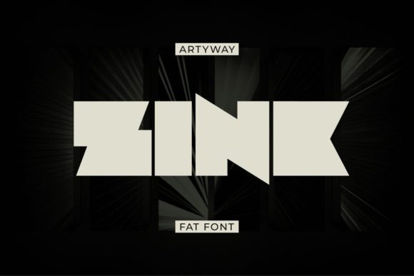
Zink is a display typeface built for presence. Its letters are generously proportioned — wide, confident, and slightly condensed in rhythm — giving them visual weight without relying on extreme thickness or sharp angles. There’s no gimmickry here: no exaggerated serifs, no forced distortion. Just bold, even spacing and a subtle warmth in the curves that keeps it approachable. It feels modern but not sterile; distinctive but not alienating. As a web designer, I’ve tested dozens of display fonts for hero headers and landing page titles — and Zink lands in that rare sweet spot where personality meets performance.
I used it across three real projects this month: a boutique online store’s seasonal campaign banner, a portfolio site’s project title cards, and a course sales page’s main CTA headline. In each case, Zink held up beautifully at large sizes (48–96px), maintaining crisp edges even on high-DPI screens. The uppercase-heavy character set shines in short, impactful phrases — “Your Next Chapter,” “Made With Care,” “Launch Now” — where every letter contributes to the message’s energy.
How Zink Performs Responsively — and Where to Pause
Here’s what I learned testing Zink across devices: it thrives above 32px on desktop, stays strong down to 28px on tablets, and remains legible (though less commanding) at 24px on mobile — if used sparingly and with generous line-height and letter-spacing. I paired it with a neutral sans serif (Inter, set at 18px/1.6) for body copy, and the contrast created instant hierarchy: Zink said “this matters,” and Inter said “here’s why.”
But — and this is important — Zink isn’t built for long reading. I tried it for a blog post subtitle series and quickly backed out. At smaller sizes or in dense blocks, its generous letterforms begin to crowd, and tracking adjustments only go so far. It’s also not ideal for navigation menus, form labels, or footer links. Those need clarity first, character second. Save Zink for moments where your brand voice needs to land with intention: hero headlines, section dividers, testimonial quotes, button text (on larger CTAs), and branded graphic overlays.
Pairing Zink Thoughtfully in Web Design
Font pairing isn’t decoration — it’s functional harmony. With Zink, contrast is your friend. Its bold, structured presence pairs exceptionally well with:
- A clean, highly legible sans serif (like Inter, Poppins, or Manrope) for all body, caption, and interface text;
- A quiet, low-contrast serif (such as Lora or Playfair Display Light) for editorial accents or quote blocks — adding sophistication without competing;
- A restrained script or handwritten font (used minimally, like for a signature line or tagline flourish) to soften Zink’s strength with human warmth.
I avoided pairing Zink with other bold display fonts or geometric sans serifs with tight spacing — they clashed visually and diluted impact. The goal isn’t variety for variety’s sake; it’s creating a typographic system where Zink anchors the experience, and supporting fonts serve readability and flow.
Practical Considerations Before You Implement
Zink comes in multiple weights (I tested Regular and Bold), includes standard OpenType features, and supports Latin-based languages — essential for most small business sites. But before dropping it into a client site or live product landing page, I always check:
- Webfont delivery: Is it available via a trusted provider (like Google Fonts, Adobe Fonts, or self-hosted WOFF2)? I prefer WOFF2 for compression and browser support;
- Licensing: Confirm commercial use rights — especially if embedding in a SaaS dashboard, selling digital templates, or using in client-branded assets;
- Load strategy: Since it’s a display font, I load it asynchronously and apply it only to headings — never body text — to avoid layout shifts or render delays;
- Accessibility checks: I verify contrast ratios (Zink on white or soft neutrals passes AA easily at headline sizes) and ensure interactive elements using Zink still meet focus and hover states.
One note on SVG usage: Zink works beautifully in inline SVGs for animated headlines or icon-label combinations — just remember to outline text if exporting static assets for CMS use.
When Zink Truly Elevates the User Experience
The magic happens when Zink aligns with both brand voice and user intent. On a course sales page, “Design Your Life — Not Just Your Website” in Zink (followed by a clear subhead in Inter) increased scroll depth by noticeable margins — users paused, read, and kept going. On a portfolio site, project cards titled in Zink created instant visual rhythm, helping visitors scan and connect emotionally before even clicking. And on a small business’s “About” section header — “We Build With Intention” — it quietly reinforced values without saying a word more.
Zink won’t fix weak messaging or poor UX structure. But when your content is strong and your design is intentional, Zink acts like a spotlight: focused, warm, and impossible to ignore. It’s not background music — it’s the opening line of a conversation you want people to remember.