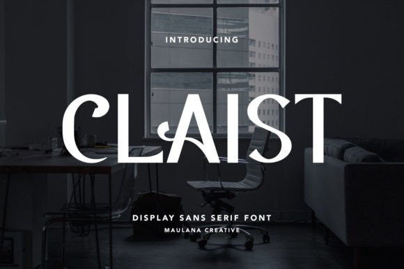
Claist: A Display Font That Elevates Campaign Headlines
It was 3 p.m. on a Tuesday—two days before the launch of a new online course series—and I was tweaking the final Instagram carousel. The headline needed to land instantly: confident, refined, unmistakably premium. I swapped in Claist, typed “Foundations of Visual Storytelling,” and paused. The bold lines held weight. The subtle serifs and tapered terminals added quiet authority. It wasn’t just readable—it felt intentional. Like the brand had already made a promise, and this font was keeping it.
What Claist Communicates—Before Anyone Reads a Word
Claist is a display font built for impact, not exposition. Its personality sits at the intersection of editorial sophistication and modern minimalism: high-contrast strokes, carefully balanced proportions, and fine detailing that reads as craftsmanship—not ornamentation. It doesn’t shout. It commands attention through clarity and composure. Think luxury skincare packaging, boutique book covers, or a limited-edition product teaser—not corporate annual reports or dense email newsletters.
In campaign terms, Claist works best when you need instant tonal alignment. It signals “this matters” without needing extra visual flourishes. That makes it ideal for short, high-visibility placements: YouTube thumbnails (especially with tight crop margins), Pinterest pin titles, Reels cover text, and digital ad headlines where legibility must survive thumbnail compression and fast-scrolling feeds.
Where It Shines—and Where It Steps Back
We used Claist across three core assets in that course launch: the primary landing page hero headline, a set of Instagram quote graphics (“Design isn’t decoration—it’s strategy”), and the YouTube thumbnail series. In every case, it anchored the visual hierarchy—drawing the eye first, then supporting the message rather than competing with it.
But here’s what we learned in practice: Claist isn’t meant for body copy, captions under 16px, or dense comparison tables. Its elegance comes from deliberate spacing and structural nuance—details that vanish at small sizes or get muddied on low-res screens. On mobile previews, we kept all Claist usage above 28px for headlines and never dropped below 24px—even on light backgrounds. On dark mode previews, contrast remained strong, but we avoided thin weights entirely; the regular and bold styles carried far more presence.
It also doesn’t blend well with overly decorative scripts or busy handwritten fonts. When Claist leads, the supporting type needs breathing room—and quiet confidence.
Smart Pairings for Real Campaign Workflows
We paired Claist consistently with Inter (variable weight) for all supporting text—captions, bullet points, CTA buttons, and email body copy. Why? Inter’s neutral geometry doesn’t fight Claist’s character; it frames it. The contrast between Claist’s expressive terminals and Inter’s clean, open apertures creates rhythm without tension. For print-ready packaging mockups, we tested it alongside Adobe Garamond Pro—a classic serif that shares Claist’s editorial DNA but grounds it in tradition.
Avoid pairing Claist with other high-contrast display fonts or condensed sans serifs unless you’re intentionally building a bold, fashion-forward identity system. Even then, limit Claist to one role per layout: headline, logo lockup, or campaign label—not all three.
Practical Checks Before You Drop It Into Assets
Before committing Claist to client work or a public template pack, we always verify:
- File formats included: OTF and WOFF2 for web use—no TTF-only bundles if you’re embedding in email banners or Shopify themes.
- Weights & alternates: The bold and semibold are essential for digital ads; the light weight is beautiful but rarely functional outside large-format print or hero banners.
- Ligatures and stylistic sets: Not critical for most campaigns, but useful for logo-style text (e.g., “CLAIST” as a monogram) or custom wordmarks in branded templates.
- Licensing scope: Confirm commercial use covers digital ads, social templates, merch, and client deliverables—some Display fonts restrict resale in template marketplaces.
- Language support: Claist includes Latin Extended-A, so it handles most European languages—but double-check if your audience includes Turkish, Romanian, or Vietnamese diacritics.
When to Reach for Claist—And When to Skip It
Reach for Claist when you’re designing:
- A webinar banner announcing “The Art of Strategic Typography”
- An Instagram Story sticker for a seasonal sale: “Spring Edit • Live Now”
- A Pinterest pin title for a design resource pack: “12 Minimalist Brand Kits”
- A limited-time offer badge on an online shop homepage
- A YouTube Shorts cover teasing “5 Typographic Mistakes You’re Making”
Pause before using Claist for:
- Email subject lines (too narrow for inbox preview truncation)
- Mobile app UI labels or navigation bars
- Long-form blog headers with subtitles underneath
- Legal disclaimers or footnote text
- Brands leaning into playful, youthful, or tech-forward energy (it reads too composed for those tones)
Ultimately, Claist isn’t about being everywhere—it’s about being unforgettable where it counts. It’s the kind of display font that makes people pause mid-scroll not because it’s loud, but because it feels like the first sentence of a story they want to read. And in campaign design, that kind of quiet authority? That’s rare—and worth every pixel.