Koondim: A Retro Condensed Font for Digital Branding
As a UI designer who builds landing pages, SaaS dashboards, and e-commerce experiences, I’ve spent years testing how typefaces shape first impressions—especially in the critical 3-second window before a visitor decides to scroll, click, or bounce. Koondim stands out because it doesn’t just look retro—it functions like a modern display font built for digital clarity and brand intention.
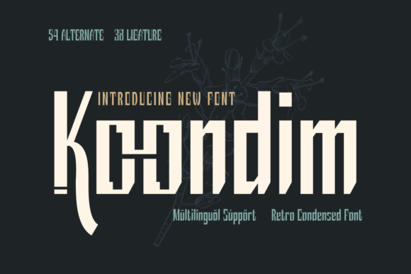
Koondim is a condensed, geometrically anchored display font with clean terminals, subtle stroke contrast, and tight letterfit. Its retro inspiration comes through in the slightly squared curves and uniform x-height—but it avoids kitsch by omitting exaggerated quirks. That balance makes Koondim highly legible at larger sizes while retaining strong personality. It’s not a script, not a serif, and not a neutral sans: it’s a deliberate typographic choice for designers who want visual distinction without sacrificing usability.
Where Koondim Earns Its Place on Screen
In real-world web layouts, Koondim excels where hierarchy and tone converge: hero section headlines, product name tags, CTA buttons, and branded section dividers. Its condensed width means it fits cleanly into narrow containers—think mobile navigation bars, app header titles, or Instagram story banners—without collapsing or requiring awkward line breaks.
I recently used Koondim for a boutique online store selling handmade ceramics. We applied it to category headers (“Stoneware”, “Glaze Studio”, “Limited Editions”) and paired it with Inter for body copy. The contrast worked instantly: Koondim set the craft-forward, intentional mood; Inter kept product descriptions scannable and trustworthy. On desktop, we used Koondim Bold at 48px; on mobile, we dropped to 36px with tighter tracking—and it held up without blurring or crowding.
For conversion-focused layouts, Koondim shines in short, high-impact phrases. Try it on a pricing card headline (“Lifetime Access”), a course sales page subhead (“Learn Design Systems in 6 Weeks”), or a newsletter signup button (“Get Early Access”). Its compact shape draws attention efficiently, and its confident rhythm supports urgency without shouting.
Readability & Responsiveness: Practical Notes
Koondim isn’t designed for long paragraphs—and that’s intentional. As a display font, it belongs above the fold, not in the blog post body. For optimal readability:
- Use it at 32px or larger on desktop, 28px minimum on mobile (with appropriate line-height and letter-spacing adjustments)
- Avoid using it on low-contrast backgrounds—pair with solid dark or light fills, not mid-grays
- On image overlays, apply a subtle text shadow or background tint to ensure legibility across devices
- Test button labels at 16–20px: Koondim remains clear at these sizes if weight and spacing are tuned correctly
It performs well on both light and dark mode interfaces when paired with appropriate fallbacks and CSS font-display settings. Webfont files include WOFF2 for fast loading, and the family includes Regular and Bold weights—enough to establish hierarchy without overwhelming your font stack.
Smart Pairings for Digital Consistency
The strongest digital identities use type intentionally—not decoratively. Koondim works best when balanced against a highly legible, neutral companion. My go-to pairings:
- Sans serif body fonts: Inter, Manrope, or IBM Plex Sans—clean, open, and optimized for screens
- Serif accents (for editorial or luxury contexts): Crimson Pro or Literata for blog headers or quote blocks, adding texture without competing
- Avoid pairing with other condensed or retro fonts—it dilutes impact and creates visual noise
For brand kits, I recommend reserving Koondim for logo lockups, social media cover text, and key campaign assets—then strictly limiting its use elsewhere to maintain consistency. Overuse flattens its effect; strategic placement reinforces recognition.
Licensing & Real-World Use Cases
Koondim is a commercial font, and licensing matters—especially for client work and public-facing digital products. Most licenses cover web embedding via @font-face, usage in SaaS platforms, and inclusion in digital templates sold on marketplaces. Always verify the license covers your specific use case: client websites, Shopify themes, Notion templates, Figma UI kits, or email newsletter headers all have different requirements.
It’s particularly effective for:
- Creative portfolios—where personality and polish must coexist
- Coaching or course websites—adding warmth and authority to value propositions
- Boutique e-commerce brands—supporting artisanal or vintage-leaning identity
- Product landing pages—creating memorable, ownable headlines that stand out in crowded feeds
- Digital brand kits—serving as the primary display face alongside supporting system fonts
No multilingual expansion is included in the base release—so if your audience spans Latin, Cyrillic, or Greek scripts, confirm coverage before committing to large-scale implementation. For English-dominant markets, Koondim delivers full OpenType features including standard ligatures and stylistic alternates—small touches that elevate polished exports and PDF presentations.
Ultimately, Koondim succeeds because it respects the constraints of digital design while delivering expressive character. It doesn’t ask users to slow down and decode—instead, it guides the eye, affirms tone, and quietly strengthens trust. In a landscape where generic sans serifs dominate, choosing Koondim is a small act of intentionality—one that pays off in clarity, cohesion, and conversion.